Making it simple:
Views navigation
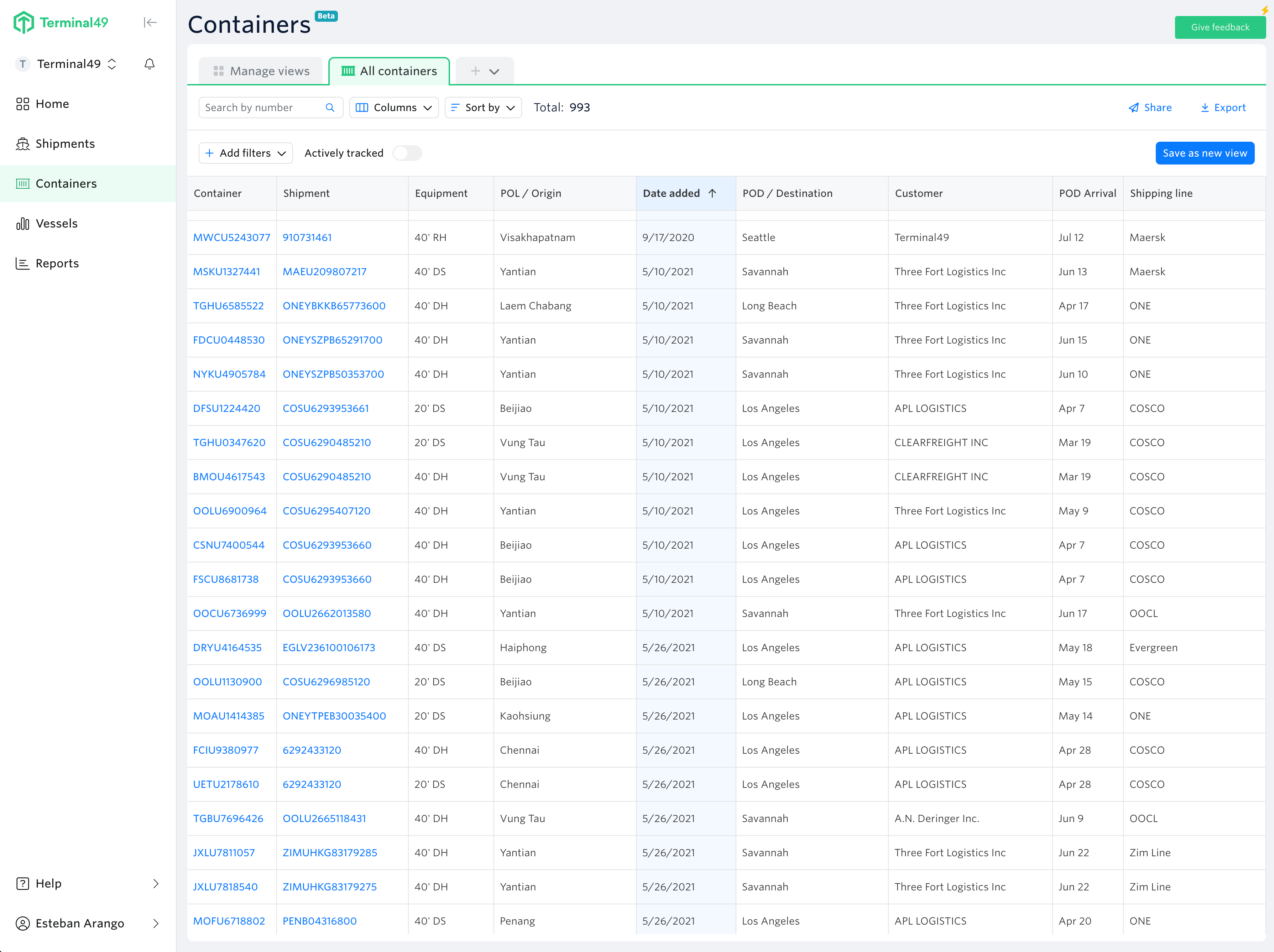
We changed the Container page layout, and instead of having the views as a right-side section, we now have a whole page where users can see their views, the company views, and the templates created by Terminal49.
Filters/Table hierarchy
We increased the prominence of the table by only showing the filter options when needed.
Coming soon: Selected filters for a view can be hidden or displayed by selecting (Show more, Show less)
Table Functionality
- The table columns can be sorted and hidden from the table header cell.
- Each column name has a definition to ensure users know what the name means. We plan to allow users to change the column name, but we still need that functionality.
- Columns can be resized in the table.
- Columns can be reordered in the edit view section. We plan to allow users to reorder within the table in a later release.
- At the cell level, we maintain the same functionality as the past design - adding to the filter and copying to the clipboard.
- Users can reorder, add, or delete columns at the edit table view level in the columns section. This modal displays all columns in alphabetical or supply chain order.
Making it efficient:
Promoting Personalization
The design intends to guide the user in creating their views. Displaying what they need and in the order they need it will increase their workflow and efficiency in accessing information.
Tabbed Layout
A tabbed layout only displays the views the user selects. The selected tabs stay saved during multiple sessions.
Template views as a start
We introduced multiple templates as a starting point for users to customize their views.
My views/My company's views
We simplified the page by providing more hierarchy to the following elements in a view: the name, the author, and when it was last modified. The filters used are available by rolling over the info icon.
